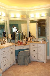
We were asked to assist in a remodel project. Our goal was to turn this out date home into a “JEWEL BOX” with all the latest and greatest, per the client. Jody was the designer on this project and she was in charge of the color palette and faux designs; all lighting fixtures; tile/ granite and carpet selections; all furniture selection and placement; and finally over all design consultation.
The home was suppose to be ready for move in early September, but due some changes on behave of the the contractor the house was not ready for move in til, yep, Thanksgiving! Because of the time of year the clients also asked that we decorate the home for Christmas too!
After 5 days of unpacking, hanging pictures, staging and decorating for Christmas; voila a “Jewel Box”!
POWDER BATH ROOM:
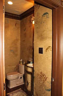
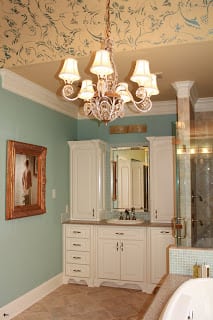
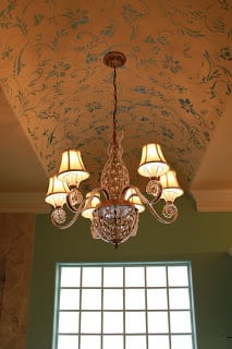
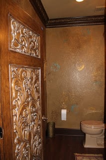 Door to powder bath matches the doors that lead to the Master suite. Walls are faux painted in a combination of metallic paints and raised 3-D stencils. Labor on faux provided by, Britta. The turquoise and deep red stencils alternate with the raised stencils to give a stunning effect. The vanity is from Hooker furniture. Jody selected a custom backsplash with four different metallic 1 x 1 glass tiles, installed by Houston Carpet and Classic. Mexican Sand colored toilet replaced white porceline one that didn’t match our rich decor. Every element in this room is perfectly blended to create a showcase powder bathroom.
LIVING/ FAMILY ROOM:
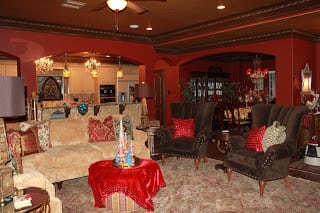
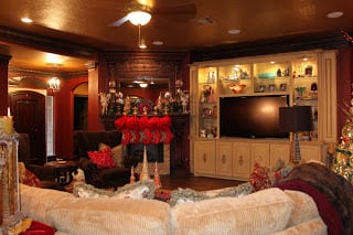
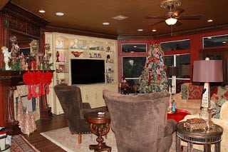
Before the living room was covered in yellow oak built-ins and the fireplace was to say the least, NOT a focal point. We wanted this space to set the tone for the rest of the house, ” jeweled”. Jody selected a deep red venetian with a light brown glaze. A rich walnut wood floor spans the room. The ceiling was painted a metallic bronze and after much debate, Jody convienced the home owners that painting the crown molding and trim with a dark brown and highlighting the details with a gold paint was just what the room called for and she was right! Any other color just would not have worked.
The yellow oak built ins was removed and custom entertainment center built by the contractor and color palette selected by Brown Interiors.
The furniture was selected with the help of the home owners, for the “tush test” then, Jody got busy selecting all the perfect fabrics, accents and trims. The Sean sectional by Highland House is in the softest ribbed microfiber and played up with jewel tone pillows and heavy fringe. If you follow our blog you know the Sean is one of our favorites and our customers too!
The high back chocolate velvet wing chairs invite you to melt your cares away when you come home. Instead of a traditional coffee table we have decide to use the clients clover shaped ottoman and have it re upholstered after the holiday season.
Mirrored end tables flank the sofa, mixed with a traditional wooden end table between the velvet chairs. Lamps can be found here in our showroom most days in stock and if you don’t find that is perfect for your home; we can always special order.
DINING ROOM:
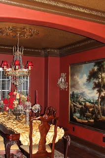 This dining room was right off the living room. We debated about whether to try and seperate the space with walls and french doors or colums. In the end we decided it was best to keep the space as open as possible and make it an exact match with the family room. The chandelier is made of turquoise crystals and we acutally painted half of the crystals a blinging gold to add pop!
KITCHEN:
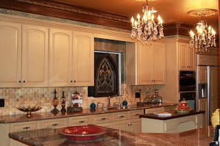
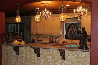
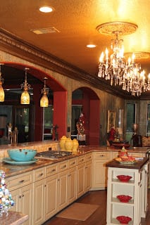 The kitchen was by far our favorite room. The pendant lights were searched for by Brown Interiors, once found we knew we had the perfect lights to bring the rich colors together from the family room to the kitchen. In the center of the kitchen we used two crystal chandeliers spaced on each side of the island. The cabinet doors were selected by Jody and then painted camelback with a brown glaze. Jody wanted the granite to blend turquoise, gold and red. This exotict selection was found at Houston Carpet and absolutely to die for.
 The tile under the bar that faces the family room is an oversize 3-d pattern with high and low tiles. It looks like ivory! We liked it so much we decided to use it on the backsplash and around the fireplace in the living room.
The walls in this kitchen and breakfast are something to talk about. After a six step process, labor done by Britta, they look like upholstery and when you are in the space you just want to touch the walls. The texture draws you in and makes you feel warm and cozy in the space.
MASTER BATHROOM:
